
People are eroding the purpose of setting a font-size in the browser by shifting the “de facto” default up by 25%.
The long-term consequence of that is gonna be a tug of war of increase/decrease/increase/decrease—your CSS is just the wrong place to set this.
There are four places prose text font-size can be set:
Of these four, the worst place to set this is b. On the site side. Making this a site-specific tweak has led to a hard-to-read hodge-podge of styles.
From an accessibility point of view, it doesn’t matter what method you use for jacking the prose size up by 25%, whether’s you use rem, em, px, rubber bands, scotch tape, it’s all the same. There’s no way to do it that’s a better way than to just let it be and don’t touch it.
TL;DR:
As a web designer, don’t touch font-size for prose text. Leave that to end users & browser devs. The “font-size” CSS property should be left unset or inherited by the browser default, especially for the main body text font for reading prose.
I get asked over and over why px is worse than em/rem when what I’ve said all the time that all methods are equally bad.
It’s two completely separate things:
The problem with setting the font-size doesn’t have anything to do with px or em.
In the settings of most browsers, the user can set font-size or text zoom. Here is Safari on iPad for example:
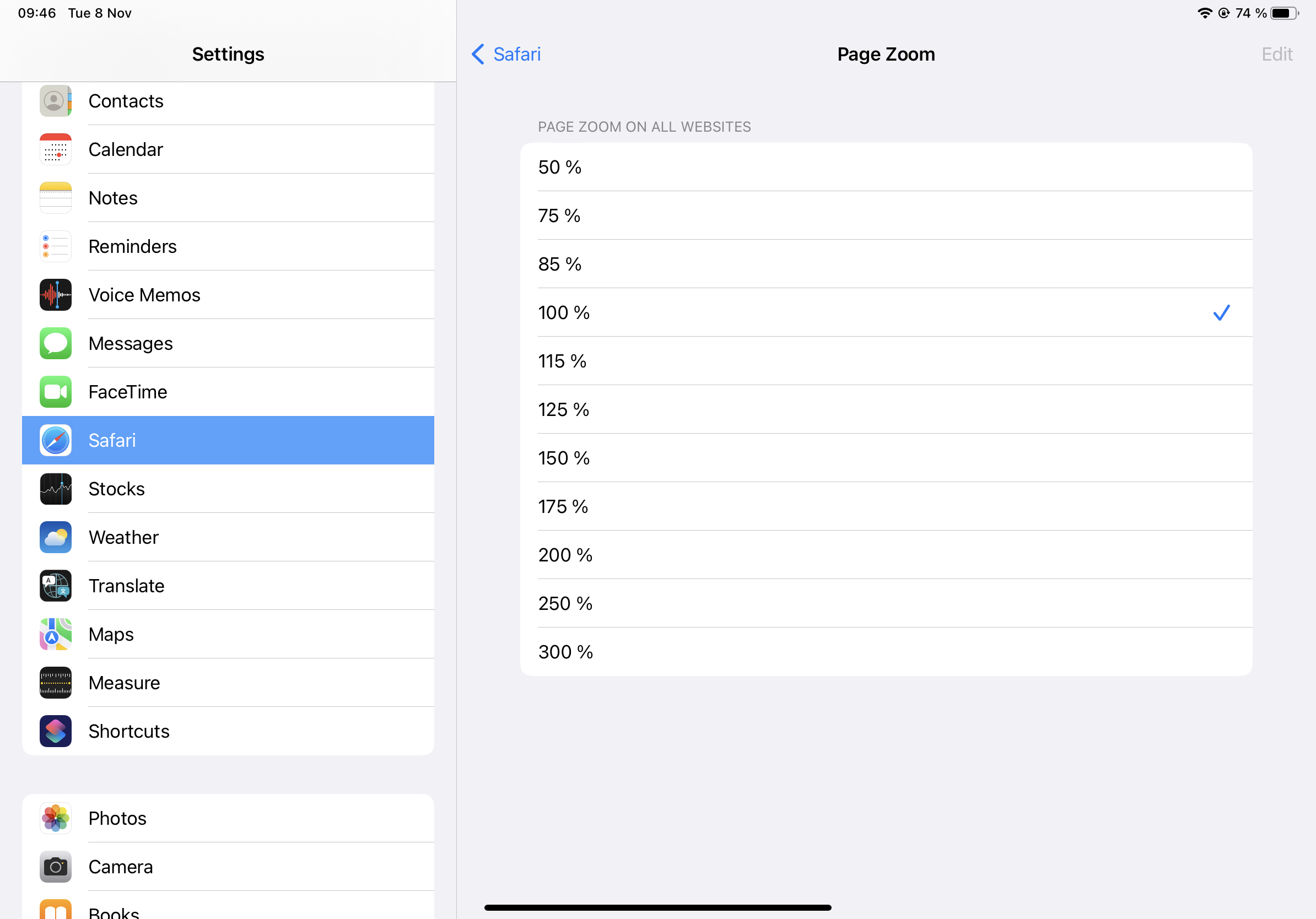
Let’s say they think 125% is peachy keen and so they set it to that. Now, everytime they come across a site that has, on the site-level, bumped it up to 20px. This user will, because of their 125 local browser setting, see that as 25px and will have to reduce that back down to 20px manually just for that website. (And that’s not even possible on Safari since there’s no 80% level.)
When sites are increasing or decreasing the prose font size on the site-level, that leads to the web being a very bumpy ride of users always having to bump up and down and personally tweak everything.
That is the problem. Rem or em or percentages doesn’t fix that.
I’m only talking about the main body font here, what I call “prose font size”, for reading longer texts (but that’s just what Pandoc is perfect for). Signage, headers, other things can be styled and resized, that’s OK. Just let text for reading remain set for reading.
To repeat myself a bit:
If it were really true that 16px was too small, and on some devices it kinda is and on others it definitively isn’t, there are three places to change that.
Each and every end user can change the setting personally. That’s a chore, but ultimately needs to remain possible since people’s vision issues are different.
Another possibility is that the browser vendors can change their default.
The worst option is to do it on the site level, that every single website on planet Earth call each other up on the Friday night phone chain and agree to bump it up from 16px to 20px. Old Angelfire and GeoCities sites that haven’t been updated since 1997 need to be ftp’d into one last time in order to add this. I think this is a very bad idea. I know there is precedent with the complete mess that was meta window viewport, but please let’s not go through that again.
Text scaling, even after setting the font-size in pixels, has always been possible, even back in the nineties it was possible, modern browser or old browser, that’s irrelevant. (Modern or old screen matters since 12px was where it was at on those old CRTs.)
Now I’ll explain why the whole em/ex thing happened. Please note that this has nothing to do with the font-size issue and is a complete sidetrack.
Back in the early days, when you were zooming in/out in webpages, sure, the text got bigger/smaller, but only the text did. Regardless of the unit the text was set in. Frame elements, images, borders, tables etc did not change. (Sounds to me like the “zoom text only” setting brings back that behavior.) As you might imagine, this led to wonky webpages. Text not fitting on their own backgrounds or in their own block elements.
That was the origin of ex and em. The idea was that you’d use these for those non-text elements you wanted to be sized relative to your text’s size. So if you had a container based around an image, you’d leave that container’s size in px, but if you had a container based around some text, you’d want to size that container in ex or em. Ex was buggy in one of the early browsers (probably IE) so em it was.
Of course, you could also use em to resize non-standard text relative to your main font’s text (although <small> and <big> were more reliable ways to do that much of the time). So em was, and still is, useful if you wanted to, for example, set a header to be exactly twice as big as the body text.
Back then the issue was actually that sites were cranking it down. Verdana was in vogue, but that’s a font that, because of its much bigger x-height and some less-than-thought-through pixel hinting decisions, looked a li’l too large at the then default 12px. So sites would set Verdana and then crank it down to 10px, leading the sites to look way too small for those that didn’t have Verdana installed. That was bad. My motto, consistent over the years: “don’t touch font-size”, ended up being a good and future-proof motto. All those sites that set it to 10px or even hardcoded the default 12px, they look way too small in this era when 16px is the default. (And px is a resolution-derived size, which made sense in the days of pixel-hinted fonts but not so much now—again, rem/em/percent are also derived from resolution, indirectly—inches and mm aren’t.)