
For those who can’t see, imagine having a bunch of marbles laid out orderly, in neat rows and columns. The rows indicate a political position (guns, let’s say) and the columns another (dope, let’s say).
We might have a hundred such marbles, ten by ten.
Each marble represents the winner of an election in a land where the population was centered around that position. So the top-left marble is from a world where people love guns but hate dope, and the population as a whole vote accordingly (Yee used a Gaussian spread centere on the marble in his simulations).
The point of this is to compare election systems.
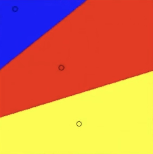
For example, we can imagine three candidates, one Cold (blue), one Heavy (red) and one Powdery (yellow).
Cold really loves guns but hates dope and is placed second from the top, second from the left.
Heavy is a centrist candidate who is meh on both dope and guns and is placed in the middle row on the middle column.
Powdery is anti guns, so is on a low row, but lukewarm on dope, say around seven marbles from the left (so more into dope than any other candidate).
So in a good voting system, if the population is really centered on a candidate’s position, i.e. the marble right under that position, that marble should have that quality. (IRV sometimes fail this criteria. That’s how much it sucks.)
In a really good voting system, we also wanna handle the case when no candidate is exactly what the people want. That’s where the Yee diagrams can help us. It’s for comparing voting systems. Each diagram shows one voting system.
So for each marble, and you can think of the marbles as li’l planets, under this voting system, if Cold would win, the marble becomes cold. If Heavy would win, the marble insteas becomes heavy. If Powdery would win, the marble instead gets a powdery feel. One of the three—each planet only has one president. All planets have the same candidates, it’s just that the population’s taste for guns and dope vary (or whatever is the topics of the day).
So in a really good voting system, we want each marble-planet to get the winner of the closest candidate, the “shortest vector”. So we’ll get these fields of cold marbles, of heavy marbles, and of powdery marbles. This is called a Voronoi pattern. It generalizes to multiple dimensions, too, in case there are other hot topics in politics.
Now, it turns out that it’s really difficult to make a voting system that has that property and can be implemented securely (by being summable at the precinct level). Which is also true for IRV, which sucks—to determine the winner, one would need to centrally have all votes.
So the Yee diagrams lets us check for two things. One is that we at least want neat, contiguous, non-concave fields. This is called monotonicity. This lowers the risk of people going “wtf happened?” after an election is overed. With IRV, we can find these weird spikes and gaps. Those are planets where the election system borked our completely. We don’t want that.
A guy made a video where he compared different voting system across the same array of planets but where the candidates were animated, moving around.
He also showed a separate set of diagrams where the planets were instead highlighted to what extent they were “off” from the idealized Voronoi result.
Since the planets are individual tiny pixels in his setup, he could have thousands of “planets”. Since video doesn’t convey temperature, weight, or texture very well, he used colors.